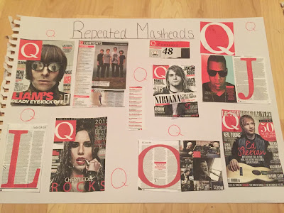
When designing my magazine, I decided I wanted to create synergy between all my pages. Through research I believe Q magazines do this effectively by repeating the well recognized logo of the 'Q'. They repeat the same logo throughout all the pages and use the same colour red for font and underlining. I want to do this for my magazine pages but use a capital 'C' to represent the class magazine.
On the front page, the Q logo is the masthead and is what the reader recognizes when buying a music magazine. Its bold and clear, so I going to make the 'C' in the word class much bigger and bolder than the rest of word for my masthead. I will then copy the 'C' throughout my pages.
On the contents page, Q uses the red colour to highlight the page numbers and underline main artists and storys. They also use features like 'Q quiz' to make the magazine unique and more exclusive than any others.
The dps they commonly use a large letter behind the article in the same red to represent the artist and use hints of red throughout the pages. They always use the logo in the corner of the page next to the number.
I will use a similar technique to Q magazines to make my masthead symbolic and easily identifiable for my target audience to the rest of the magazines available.

No comments:
Post a Comment