Friday 30 September 2016

Research 2 the front cover of Q 2010-Cheryl Cole


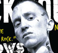
The image is a close-mid shot which gives a wide view of Cheryl Cole's face. Her face purposely looks pale to enhance the black eyeliner under her eyes and her dramatic red lipstick. The red and black follows the colour scheme but shows a different meaning. The red indicates love and seduction and the black eyes show independence and being dominant. It also seems like its raining to show she is serious and its quite dramatic.The whole magazine is focussing on the cover line 'Cheryl Cole Rocks'. So her fist is clenched with a silver stud to represent power and aggression. The picture is like this to tell the audience that Cheryl has transformed into more of a rock star compared to he stereotypical pop star she is known for. The image is quite provocative and would be aimed at a much older audience then children and would attract more men. This also links to Dyer's theory 'a star is an image, not a real person, that is constructed.' As Cheryl is portraying this certain rock look even though she is still a pop star. You can tell by the image is a studio shot so Cheryl is purposely portrayed to look like this for the magazine. The way she looks could also link to Laura Mulvey's theory as the picture looks quite seductive and men would be interested in reading about the artist.


This masthead is a hugely well known brand identify for Q magazine every magazine they use has the same red background and white Q. The red represents the passion the have for there music and the colour symbolises 'stop' to suggest to there audience they should stop and buy this magazine. This magazine has decided to not follow the code of the magazine by putting the image behind the masthead. The masthead is very bold and takes up around a quarter of the page. The red is bright and is actually the colour scheme the follow for this magazine. Throughout they only use black,white and red. All these colours are dominant and quite classy and even though Q doesn't focus on rock magazines normally,they have followed the rock colours but kept the Q style.
They have located the issue date and price on the left hand side of the front cover, instead of the bottom corner. The font is very small as they don't want to advertise the price so much. Also, all this text on the left is above a coloured box. Four of the cover stories are used with a white box to indicate there is an article about them in the magazine. However 'Them Crooked Vultures' are used with a red box,the same colour of the masthead. This is used to show this cover story is more important or more interesting. At this time this band must of been popular so the magazine has highlighted it as the audience would be interested and familiar with it. I think the coloured boxes are effective,they look bold and attract the audience into it.


This the banner of the magazine. Using the word 'biggest' motivates the audience into buying the magazine and encouraging them to find out why its the biggest magazine in the UK. They use the black background so it blends in with the image's background and the white text to stand out.


A puff is used to make certain information stand out compared to the other text from the image. Using the circle shape with the grey colour is bold as minimal grey is used on the whole front cover. However they still use the red,white and black coloured font. As the artist is mentioned it says there is an article inside about him and using the word 'unseen' encourages the audience there is unique photos and information about the artist inside.

The title says '3 words...Cheryl Cole Rocks' referring to the rock style the magazine is portraying.The title is quite abstract as you wouldn't expect this,so it would be intriguing for the audience.  The text is bold and in San Serif font and uses the typical rock colours. The title is purposely broke up using kerning to represent its been smashed or really enhance the word 'rocks'. The whole magazine also uses different semiotics to make the message clear. The image and colours are iconic signs of rock but also the red colour is symbolic of passion and power. This linking to Barthes theory which is used so this individual magazine and artist are representing the image created to sell this magazine.


How research has informed my creativity and planning: 

  •  I like the background and the bright red,its very bold and effective.
  • I think the boxes around the cover-story text make them look bold
  • I don't like the crowded text on the right hand side
  • I would choose to put the image above the masthead. 


Wednesday 28 September 2016

Front Page And Contents Of New College Magazine

This is my final front cover for my college magazine. I think its an effective and intriguing magazine but i think it has a lot of improvements. The audience which is the college students are aware immediately know what the magazine is but i don't think the picture is clear enough. I would chose to do a more close up shot with the student looking direct to the camera. The audience would then see a clear expression and be interested in buying the magazine. I wouldn't change the masthead as its clear and bold and follows the codes and conventions of a usual magazine. I then would improve the text around the image. I would use a slightly bigger font to make it more easy to read and I would try different font colours. Even though the colours I used didn't clash with the background I believe they could be more effective and bold.

This is my final contents page for my college magazine. This would be used for a quick and easy way for the audience to see whats included in the magazine and tell them what they should expect to find on each page.

Tuesday 27 September 2016

School Magazine Draft Front Cover And Contents

This is the draft for my school magazine front cover. I've decided to call it 'Weekly Sixth Form' to indicate you would get the magazine weekly and link to going to school every week. I use the font colour blue so its the same colour of the schools logo and it would be in a bright bold font to stand out and attract people into buying the magazine. The main element is the picture. The picture is of a student and it should be a mid-close up shot. They should have some eye contact to the camera and should have a happy expression to intrigue the audience. I will then use a small amount of bold text around the picture to inform the audience about what's in the magazine. One text box would be a list of 'Top Tips' to help students who the magazine is aimed at about little things that would improve there college life. I would then use key statements around the student like 'stressed?' and 'tired?' so the audience could relate and feel the magazine would be useful for them. I also added a 'News flash' which would be a article in the magazine of a recent story and finally I an advertisement for a free pen which would attract people to buy the magazine. I would use a light blue background and yellow and black font to stand out infront of the blue.

This is my draft for my contents page. The title would be in the same blue which is used in the front cover and the same blue for the background. The text would a small black font to inform the audience about what's in the magazine and I would use small pictures that links to the text.

Monday 26 September 2016

Research-Front Cover Research 1 Rock Sound Gallows

This is a rock magazine published by Rock Sound in 2009 and they're focusing on the rock band Gallows. The picture covers the whole page and is the main element of the cover, the singer is Frank Carter the lead singer of the rock band, Gallows.

Rock is known to be a very heavy metal genre and to be a dark and aggressive tone. This is why Carter has direct eye contact to the camera to make him look intimidating and the picture is very in the audiences face. The first thing you notice is the hand which is swearing right towards the camera. With the artist swearing at you, it immediately portrays the attitude that he's not bothered or could even show
he is angry.

The artists face has minimal expression, he looks very neutral which could be seen as angry and he has a shaved head which people think makes others look more dominant. He is wearing a white vest top to purposely show all his tattoos which stand out as most of the image is white to contrast with the black background but his tattoos are in black. Tattoos are known to be on strong and hard men which also links with the aggressive person which is shown. Another thing is he has a bruise on his head which could show hes been in a fight. All these elements give a aggressive manner which links with the genre of the magazine and are symbolic to the genre of rock. This are iconic semiotics of the genre and symbolize aggression linking to Barthes theory which make the make so recognizable for the audience. However, on his fingers there is the word 'bluf' tattooed which makes the audience think is he really this aggressive man the magazine is portraying him to be or is he ' 'bluffing'everyone. This element links to Dyer's theory of 'a star is an image, not a real person, that is constructed.' So even though he looks violent and hard he might be a nice person.

The masthead is spread across the whole top of the front cover and says 'Rock Sound'. This is the name of the publishers and is a housestyle for all there magazines. This certain magazine,the font is in white contrasting the black background and they purposely used a white font to make it stand out and clear to read. Even though some of the text is covered by the image. The audience can still easily recognise it as the magazine is so well known. The font is very bold to reflect the music the magazine is based on.

The text gives information about what the magazine is about. This magazine has one feature story about the Gallow's which would be the main attraction for most of the buyers. This is why the font is different to any others,its much bigger and the word 'Gallows' is a different font. The quote is in yellow this is so it stands out even more and most the text used is white. The quote says 'were putting the boll*cks back in rock'. The swearing links to the image and indicates this band are coming back and bringing back the heavy rock.
All the other cover story's are white and black font but in front of a coloured box. These colours are very bright compared to the black and white theme which could show this story's are not as aggressive as the main one. Doing this, makes it clear it is a separate story to the picture and in this case there is two cover story's. One of them is to tell the audience about a new upcoming tour. The cover story is in red to suggest rage or anger which links to the facial expression the image is showing next to the text. The image looks like he is screaming or shouting which links to the genre of the music where the artists normally scream and shout in there songs. 
The other cover story is on the left side in the black and white with a larger image which follows the codes of a front cover. This must be a common rock artist and would be recognised by a lot of the audience. 

Another key part of the front cover is a plug to advertise two giant posters in a yellow background. This would highlight the plug and catch the eye of the audience as they would like and recognise these bands. The yellow could also suggest caution as the images are quite eerie,scary and uncomfortable for other people who are not use to the darkness of rock bands. 

Also, this certain magazine uses a list to name some more artists the magazine focuses on to reach and attract a larger audience and has a short story heading in its banner. They also use a plug to advertise the huge amount of articles inside the magazine. The use a black circle with white font to make is stand out compared to the rest of the image but still following the rock colours. The plug shape is ripped in the corner this is used as rock genre is quite rucked and violent. It suggests it been ripped and destroyed.  At the top of the magazine there is also a plug to advertise a 'free CD' this would intrigue the audience into paying the price over any other magazine in the shop as the music would be suitable for them as the genre would be the same the magazine is focussing on.

Most of the features,follow the codes and conventions of music magazines. It has a masthead which stands out and a main picture and cover storys to attract people into buying the magazine. However, most magazines put the full band on the front cover as more people would recognise all the artists together and may not know them individually. However, this magazine has just put Frank Carter on the cover. Even though the story is about the whole band they would of just used Carter as he is the most intimidating and the one who quoted the quote which the article is about.

How research has informed my creativity and planning:

  • I like the use of black and white, i think it looks effective.
  • The direct eye contact intrigues the audience.
  • The tattoos are a clear statement but hard to recreate in real life but i could use some fake tattoos or find someone with a lot of tattoos.
  • I would want to use more bright colours. 


Make-Up Look

This is a picture of Rihanna I found on Instagram, I particularly like her make up look and hair style. Her appearance was styled like this for her Dior photo shoot. However, i believe her look would be effective for a classical music magazine front cover. The look is classy and soft to fit the genre and the look stands out even though there is nothing that bold about it. I would use a similar look and hair style for the front cover if i chose a classical theme as its appropriate for that genre. Even though you associate bright bold lips and red hair with rock or a more heavy style of music. The way Rihanna is presented it gives a much more high class and vogue look.

Monday 19 September 2016

Bauer Music Institution

Bauer

Bauer is a huge media group, which is a family ownership founded in Hamburg in 1875. They now operate in 19 countries including the UK, Germany, Poland, Australia, New Zealand and the USA and has 11,000 employees worldwide.They focus on radio and magazines which reach over 25 million consumers.
Magazines
 They publish magazines for a huge range of the market by publishing different types of magazines. 
All of there magazines are to inform or entertain. Popular magazines include huge information and advice about specific topics:
Angling Times
Bird Watching
ClassicCars


Mother & Baby 
However, the also publish hugely popular music magazines like Q, Kerrang and Mojo. 
Q-pop magazine aimed for 15-25year olds
Kerrang-Rock  aimed for 18+ commonly men
Mojo-all genres-16+

Digital
They use social networking sites to get the audience interacted into subscriptions and competitions available in the magaziine. They have over 40 million users on there website so this is an effective way to connect with there audience. There audience will all be familiar to technology and this is why social network sites are used.

Radio
Bauer Media UK has the biggest commercial digital radio audience, with over half of total Bauer Radio listening taking place via a digital device.

TV
A seven-channel joint venture TV business with Channel4.  Reaching 16 million viewers per month and offering more music than any other TV network, Box Plus Network brands include 4Music, KISS, Magic, Boxhits. A lot of people prefer to watch and listen then read information so this is a effective way to reach all the audience.

Friday 16 September 2016

Codes and Conventions of Music Magazines

Selection and Rejection


This is a medium shot of a student which has direct eye contact to the camera. I believe this is a good photo to put on my magazine as the photo shows a positive side of the 6th form as the student is smiling which attracts the audience into the magazine. Also in the background there is a logo of the 6th form school which immediately tells the audience which 6th form the magazine is aimed at.


This photo is a long shot of a student in the common room. I like the way the student is on the side and doesn't have eye contact towards the camera. However, i don't think the background is suitable to put on the front cover as the picture as it isn't crisp and has too much colour.


I really like this photo as i think its very intriguing and suitable for the front cover. It is clear that a student is working on a computer and that the student is happy. However you cant see much of the student, more of the room. I would prefer to see more of the face but still be clear that he's working.
                                                               
This photo shows much more of the student as the camera is a medium shot at a different angle compared to the other. It shows more of the expression but still can tell he is working. The photo is crisp and i believe it would fit my magazine front cover.

Friday 9 September 2016

Response To Brief

Im very interested in music so I'm feeling positive about this task of making a music magazine. The music i listen to is very common for my age so i believe my magazine would attract my age group. Most my audience will be able to recognise the names and images i use and would be interested to read about them.

OCR G321 Print Brief

Preliminary exercise: using DTP and an image manipulation program,produce the front page of a new school/college magazine,featuring a photograph of a student in a medium close-up plus some appropriately laid out text and a masthead. Additionally candidates must produce a DTP mock-up of layout of the contents page to demonstrate their grasp of the program.
Main: the front page,contents and double page spread of a new music magazine.