Saturday 22 October 2016

Research 3- Contents page Spin June 2008

This is the contents page of the Spin Magazine from July 2008.
The image is of the indie folk band called 'She & Him'. Overall the magazine is organised and has formal register so the audience would be around 18+.The image is in the centre of the page and is the main feature of the whole contents. It is clear the image has been edited and has been taken in a studio as the colour's in the image are a lot more bolder than the background. The image gives quite a quirky look which links to the genre of the artist. Their faces look very pale and flushed,this follows the theme of the black and white colour's but could suggest they're hiding something. You can still tell there making eye contact which is used to intrigue the reader and they have minimal expression to evoke the reader to wonder what they're trying to say as most of the face is covered by the hats. This links to Feuer's theory that 'genre is abstract and becoming harder to identify'. I believe that if you wasn't familiar with the artists or the magazine the image doesn't give a immediate indie folk style. Also, as Spin magazines vary in the genre of there magazines it makes it harder to identify the genre by looking at this front cover and would make the reader have to carry on reading to help there understanding.


Typically in Spin magazines you can see all the artist and in this particular magazine the publisher wants you to see the stance of the artists. Sitting on the chair together shows the connection between the artists and it gives quite a dominant look as they seem to be looking down to the camera. They are also wearing the same outfit which is quite a formal smart style which links with the organised layout of the page.
This contents follows the conventions of Spin magazines. The five cover story's are located in a column on the left of the page and are all in white to stand out from the grey toned background. There is subheading above all the cover story's to direct the audience. This is in the same bold as all the artists listed below it showing they are the key parts and making it easy to read. Then smaller font is followed after the subheading giving a small insight to what the articles are about inside the magazine. Also, there is leading used to separate each cover story. 
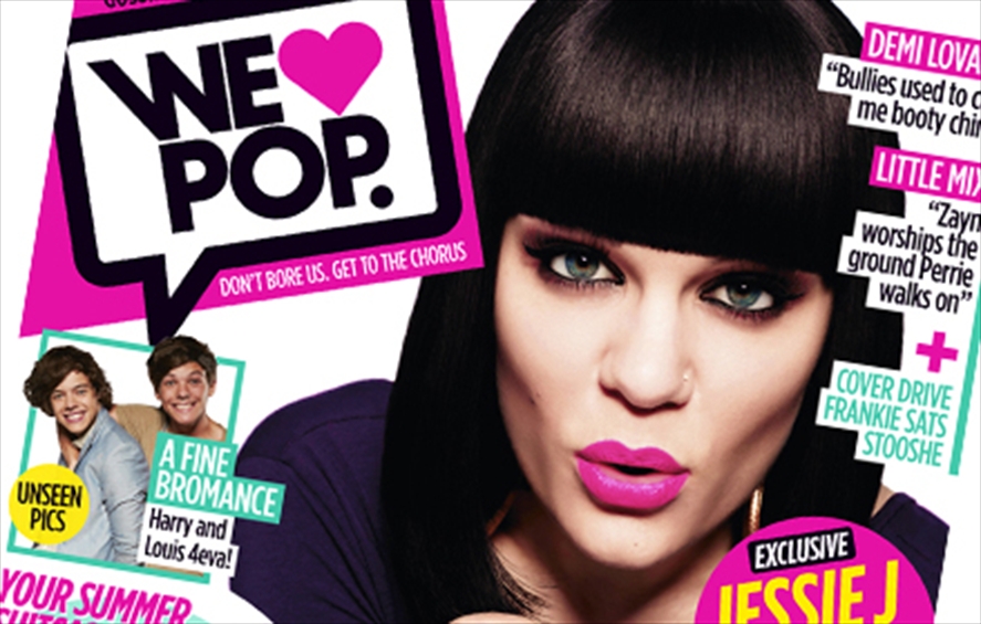
The masthead is in the top left corner which very commonly the location in a music magazine which grabs attention immediately at first look.It is big enough to make it look effective but not be distracting. In this contents the masthead is the only feature which has colour. The red and white work together and
red is used as it is a representation of passion and love. The word 'SPIN' links into music as it could be a connotation of a spinning record or CD.  The font is in white like all the other font on the page. However kerning is used to make it look bolder and dominant. Underneath the masthead the date is there in the same white small font. The date is conventional as it shows the reader that the issue is up to date, recent and reliable.

The other top corner they're is a pull quote,which is taken from the artist which is in the image. This gives the magazine a unique point and make the magazine feel more direct to the reader as its personal. The purpose is too attract the reader to carry on. The quote is normally a specific one so it is intriguing, this one uses a buzzword like 'luckiest', this makes the reader think why she believes she is the 'luckiest girl' and is clear that you would find out if you carry on reading persuading them to find out the information. 

At the bottom of the page there is only one puff, it uses a dark blue which is not as bright at the red in the masthead so its still quite a neutral colour with a subheading 'on the cover' which includes the page number and what features in the magazine. 


How research has informed my creativity and planning:

    •  I like the use of grey-toned colours so the masthead stands out the most. 
    • It needs more connations to the genre on the image so its easier to recognise.
    • I like the font of the masthead and how each letter is individually typed and then put together.

Research 3 Double Page Spread Analysis- Kerrang

Friday 21 October 2016

Research TA-Mastheads

I asked 12 people which masthead from my planning they liked the most and would fit my magazine the most effectively. The most popular font was A. However, i believe this font is too typical for a Classical magazine. As i want to revamp the genre and make it more young and exciting, i think the masthead needs to be a recognisable image from all the other Classical magazines thats its aimed at a younger audience. The other two popular fonts are more unique, there a handwritten font which breaks conventions but still shows the classy feel of the genre. As they're quite simple i would use a bright colour to shows its for the young audience. I prefer font C as its it more flowy and symbolises the scrolls you expect to see on a classical magazine. I think C is the most effective and modern for my magazine.

A.B.

                                                                                                                 C.

Planning Post-Mastheads


Wednesday 19 October 2016

Final Classical Music Magazine Ideas- Make Up


 Looking at already existing magazines when the artist is a women, the makeup is normally bland and neutral. No bright colours are used or dramatic looks,this is to fit the posh look the genre follows. However, as i want to attract the younger audience and I want my magazine to fit in the gap of the market. I'm going to use a dramatic make up look, even though my star will be in middle class clothes eg.jeans. The make up will be bright and bold which you would find on a young artist in a teens magazine. I will create this look by using bright eye shadows and a black eyeliner similar to the image shown. This will intrigue the 15-20 aged audience and make them curious why a classical artist has such a dramatic young look.


Codes and Conventions of Classical Music Magazines


The conventions of a classical music magazine is mostly the same in every magazine made by different publishers. Usually, the masthead is 1/6th of the front page often in red,blue, black or white. The colours are normally clean and classy and anything bright like pink are never really used, this is because the audience is much older. Colours I've found quite commonly used is gold and black, these colours together show quite a premium style which fits the high class stereotype.
I'm going to follow the convention of giving my magazine a classy look using neutral colours throughout my magazine and follow the same the colours too my contents and double-page spread. I like the use of black and white which would make it clear its a classical magazine but use hints of bright colours like pink,reds and greens. These bright colours appeal to a younger audience and make it feel suitable for them. 

The main feature is the image and normally there is the full photograph of the model in a medium or medium long shot. There is only one image on the front cover and a cover story about the specific artist and the artist is normally dressed up to look high class in gowns and suits. Some magazines use black and white images to give a vintage look but some use colour depending on the background. Sometimes the background is one colour so all the other features stand out but others are scenic. People expect to see old buildings and castles when seeing images connecting to this genre.
I'm going to follow the code of only using one image and using a medium to long shot. I've decided on my front cover the image will be black and white and that i'll have a scenic background. However, to challenge the convention the backgrounds are going to be much more urban and the artist will be dressed very middle class holding a violin which will be still a traditional genre representation. 

The front cover is always very organised and have a few features to inform and attract the audience into the magazine. Normal features used are pugs and only ever one puff which is simple and small. One cover story in San Serif font and in a small neutral colour. Throughout there is also little dots,lines and scrolls which immediately tell the audience its a classical magazine and give it a unique touch.
I'm going to follow all the conventions of these features but use much more bigger and colourful font. The puff will be in a shape which you would normally find on a children's magazine.


Monday 17 October 2016

Research 1- Double Page Spread 'Shovels & Rope'


 How research has informed my creativity and planning:

  • The drop capitals are effective
  • More bright colours to attract the reader
  • I like the size of the title and serif font
  • I would separate the text into more columns so more appealing to read 

Initial Ideas and Creativity post

My final music magazine will focus on the classical genre, I have simply chose this by looking at a range of genre magazines. I much prefer the organised classy look to the crammed and dark colours used in rock magazines. I will create a similar style and follow the same conventions of usual classical and acoustic magazines but I'm going to enhance by adding much more brighter colours to attract a much younger audience and persuade them that classical isn't just for old and the upper class audience which is stereotyped with this genre.  My magazine would fit in the gap with the market as no classical magazine in today's society is exciting or intriguing enough for any teenager.

I've decided my star is going to my mum,she is willing to dress up and travel for my photos and she is very familiar with the genre. She has inspired me into this genre and I'm able to get handle of a violin for my photos which is a typical instrument used in this music style so the image will represent the genre but the artist will be unique. I'm going to make her look casual and middle class,wearing jeans and a plain top. She will wear minimal makeup but quite bright so the facial expression is still clear as the shots are going to be taken from a long shot and her hair will be natural. This goes against the conventions of a normal classical artist which is usually dressed posh and upper class. Im going to be creating that 'the star is an image' as my mum will represent the genre but typically she is just a normal middle class women linking to Dyer's theory.  My magazine will represent a more up beat classical genre which will attract the younger audience.

I'm thinking to do a lot of scenic backgrounds but totally opposite to what people would expect. Normally classical shots are taken in old fashioned buildings, castles and flower fields. However, I've decided that i will take my pictures in a range of close to long shots of the artist in more urban areas. One place will be the humber bridge,a wide shot of the bridge in the background would be effective to use on a DPS as the image could span across the two pages.  I also think I'm going to edit my images to black and white to follow the clean and classy look that is normally portrayed but change the text to much more bright colours to stand out. As the text will be revealing the key information about this new upcoming artist.

I will have synergy from my three pages using the same masthead i create in the top left corner on every page,to make it clear that would be a house style for my magazine. I've thought of using bold and bright text to exaggerate how important this new article is. I could use red to symbolise its a 'warning' to suggest this artist is going to make an impact in todays society. However, i will decide after I've taken my pictures so i know the colours wont clash.

My story will be about this huge new upcoming artist going on a tour. Using buzzwords like exclusive to attract the audience into the unique magazine. I will write the article and tell a story about how this artist is middle class and that she doesn't feel suitable to be interested in this genre. However, the artist is going on tour aimed at a much younger audience which will persuade the audience that they can listen to genre and it be a average genre to listen to in this society.


Thursday 13 October 2016

Research 2-DPS Analysis Rolling Stone Magazine

This is a  double page spread from the Rolling Stone Magazine focusing on the popular pop/classical artist Adele. The image follows the conventions of a double page spread. It takes up most of the page and is a close mid shot of the artists face.  However commonly the image is on the left side page but this image is on the right. The close shot reflects on the text, on how personal and direct the text is too the audience. The image is a studio shot and they have purposely made Adele look classy and elegant to match her music and the article. Minimal makeup and natural hair to reflect on her true self and the personal story. The black eyeliner symbolizes a vintage and bold look to give a overall polished look.

However,it challenges conventions as there is no eye contact towards the camera which usually intrigues the audience but in this article the most direct part is the text.The article is in black and white to have a classy feel and the artist face is quite promiscous which could attract the male audience which links to Mulvey's theory that states women are viewed for the pleasure of men.

The DPS uses a drop capital at the start of the text.It is considerably larger but the same font is used throughtout.  The 'I' is a personal pronoun and is emphasised to make the article more personal. The article  is Adele talking about herself which will  attract the audience to find out more about this popular artist. Also the drop capital is the start of a quote which indicates its what Adele has said and make the article look exclusive, the quote is normally quite shocking to intrigue the reader to carry on  which is a type of The Expose form.
 As adele is talking about her self the langage and register is quite casual.The language is informal as slang, swearing and colloqualism is used which goes againest the formal  and smart look the article overall portrays. Also as swearing is used in the text the shows the audience will  be much older.

Even though the text is the same, the DPS does not use columns which is commonly used to seperate teh story and make it more appealing to read. However, this makes challenges the conventions as the text is written in one singular column. This could symbolise the one big conversation Adele is having. As this is for a older audience,the magazine is made to look mature and unique. So a thin line is used to separate the main article with the lead and a small black box is used at the top of the page. The lead uses a buzzword to intrigue the audience  'biggest' to make the audience believe its unique and worth reading.

The is much bigger font compared to the rest of the text and is in serif font. It gives a antique and vintage look. The word 'triumph' is used and means victory so it suggets the artist is successful and has achieved something and worth reading for. The artists name is also used in the title to immediately indicate who the artist is. Using the artists name in the title is a code for the Rolling Stone double page spreads.


How research has informed my creativity and planning:
  • The text font and size is effective and clear
  • The drop capital is effective
  • I like the natural look
  • More unique symbols and pugs

Friday 7 October 2016

Research Contents Page 1- Acoustic Winter 2013

Links,Synergy and Brand Identity


All Q magazines have synergy between there front cover and contents page:

  • same red colour to highlight key parts
  • similar font using black and white
  • masthead in top left corner
  • underlined text
  • same font used throughout
  • clear bold images
  • quite a packed page full of images and text

How this research has influenced my planning and creating:
  • use the same red colour throughout to create a brand identity
  • i like the underlined text to separate story's
  • i would use less images and less text

Monday 3 October 2016

Research 3 Front Cover Analysis-Q Magazine Michael Jackson


This is another Q magazine, it has the same masthead as its a house style for them. The same red and white Q is used to represent there company and is a code for them. However in this magazine the masthead is one of the boldest items on the front cover.  It takes up a quarter of the page and highlights the red writing as the font is in the same red where as all the main image colour's are grey and black tones. Compared to the red the grey's are neutral and look quite serious where the red is eye catching to certain areas.


The only image on the front cover used is an iconic picture of the well known pop star Michael Jackson. This breaks one of the codes and conventions as commonly there would be more then one picture linking to different cover story's too attract a bigger and wider audience. These immediately shows the audience is much older as children magazines have much more pictures and brighter pictures. Also,having one picture could suggest this story is so intriguing and interesting that its worth buying the magazine just to find out about this one artist. This was purposely published after his death as people would still want to know what caused his death. The image shows the pale,ill face of the artist. He looks old and not healthy. Even though some of his face is covered. Michael Jackson is so well known, people can still recognize his face. This is also breaking a code of a front cover as the artist is usually making direct eye contact with the camera to intrigue the audience. The glasses could also link to the title 'Michael Jackson Unmasked'. He has a serious expression which could suggest he's hiding something and he's not                                            
giving anything away but the article will tell you what's he was hiding.


There is a banner at the top using white and serif font with a black background. This is used to be clear from far away and persuade the audience to buy the 'biggest' magazine in the UK. The right side is used for cover story's in white writing with red lines separating the different story's. The red and white texts suggest the articles are quite serious and deep and the publisher has put the important text in serif to make the text bolder then the rest of the text. The left side has a puff 'C.S.I Rocks' which is little bit of information in a border to stand out.  Even though the magazine is focussed on pop artist it shows the magazine inside offers different genres like rock too.


The barcode is located in the bottom left which is were its expected on a magazine to give the price and issue date. It shows its professional and gives the audience which is more of an adult audience as the colors are bold instead of bright the reason to buy it. 

 How research has informed my creativity and planning:
  • I like the grey toned colour's to highlight the main elements with a red.
  • I really like the red lines which separates the cover story's and makes it more intriguing as it looks less text.
  • I would make the title much bigger and bolder and easier to read from a far.