
Friday, 25 November 2016
Wednesday, 23 November 2016

Sunday, 20 November 2016


Friday, 18 November 2016
Images of Artist-Flickr
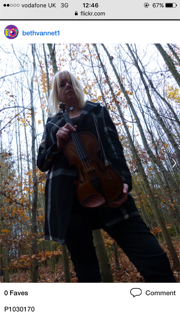


 I think this image shows too much of a soft artist when first looking at the magazine. Even though the colours have synergy between the leaves and violin, the star isn't looking at the camera. I could use this image on my contents and use a statement suggesting she's looking pass the media and focusing on her music.
 Wednesday, 16 November 2016
Photoshoot 1 Reschedule Front Cover
I planned to take my photos of my model for my front cover last night. The location was in a woods which is near my house and all the costume,makeup and equipment was prepared and organised. However, due to traffic my mum who is my model didn't get home for when she expected so if we did take any shots when she got home the lightening of the area wouln't of been bright enough to get any effective shots due it to being the evening. This means I had to rescedule my shoot to the weekend when I can get my shots in the daytime. So till then, I'm going to focus on writing my coverstories for my different pages.
TA Research Analysis-Questions
I asked 5 people in my target audience to answer my questionnaire, I asked 2 boys aged 16 and 17 and 3 girls aged 14,16 and 18,all these people were students of a middle class I used a range of ages to get a different opinion on my magazine and to decide what ages and gender like and dislike specific features. 3 out of the 5 people wrote out there answers and the 2 others filled the questions out online over facebook message. I will collate my answers and improve my magazine to make it more appealing to my target audience.
My first question asked how people consume media, this will give me a idea how most of my target audience read media and too see if people of my age read magazines. I found out that only 2 people mainly consume media by magazines and the others consume it over the internet or using technology like there phone or radio. This suggests that I need my magazine to be very appealing and intriguing so my audience firstly considers to pick it up in a shop and secondly buy it instead of downloading a different one.
My next two questions asked 'If you don't buy magazines, why not?'. The overall answer was that technology is easier,cheaper for someone that doesn't make a lot of money due to my audience still being teenagers. I then asked 'What would persuade them to buy a magazine?'I asked this to make me clear what they want to see on a magazine to consider buying mine. All the 5 people want too see new artists, tour details and gossip or secrets about someone. My magazine uses a interview which will give small details about my artist which I think might attract them into my magazine but I'm going to add a feature advertising a tour on my front cover.
Question 4 asked 'What genre came to mind when seeing my masthead.?'. Everyone said classical so I'm not going to change it in anyway as it must be clear what genre it is and its effective for my magazine.
Question 5 asked 'If my whole front cover is intrigiung?'. Everyone also said yes but two added that the front cover needs more features. I know that magazines aimed at a younger audience uses lots of features as they like too see a lot for what they pay but I think I'm only going to add a couple more because I still want my magazine to look formal and classy. One person did add to the question that the artist needs to make eye contact so I'm going to experiment with different shots at my photoshoot.
The next question I asked is 'What is the first thing you see when looking at my magazine?' Two people said the image, 2 others said the title and the other one said the name. This makes it clear that different people see different things when they first look. I think this is effective as not just one feature stands out but the front cover is still intrigiuing. However, I will experiment with my features on where to place them on my cover and see what looks more effective.
My next questions focus on if my magazine includes enough to make it worthy buying, as my target audience is around 15-20, commonly they don't have a lot money or spare money to spend on a magazine. It's the age when they start getting a job but they may not be willing to pay a high price for a magazine. However, classical magazines are usually priced highly which the stereotypical audience are willing to pay. So I asked if there is enough features on magazine to make them consider to buy it. 2 of the 5 which were the oldest of the group actually said there is enough features to make them look inside and buy it. The rest of the group answered that they would want too see a couple more features just to attract more of the audience and to clearly make them think there getting a good quality magazine and that they should pick it up instead of downloading a different type. Initially I was charging £3.99 for my magazine and most of the group said they're willing to pay that but they also added that they don't think all students would. I might have to consider lowering my price to make it more suitable for all my target audience.
The next question were all answered the same, everyone said yes. The questions were asked 'If the front cover and contents have visual links? If my magazine is intriguing? and If my font is clear and easy to read? So, visually I don't think I'll change my magazine as all ages and gender like it and think its effective for my genre. Also, I then did go onto ask if they liked the black and white theme. I decided to use the black and white as the classical magazine needs to look formal and unique. They all went on to say they liked it and that the theme makes it look classy but also that the highlights of color are effective for younger audience. However, I needed to ask what features I'm missing to give me a idea to what they would want to see to encourage them to buy it. 3 out of the group, wants to see a free CD or poster so I'm going to add a puff of a free CD of my new artist I'm advertising but also a competition to win tour tickets. This will be another reason to attract my young audience into the magazine.
Question 14 was 'If you were to put my magazine back down in the shop, what would be the reason?' They was two answers from all 5 people, 3 of the group said the genre. As classical isn't a common genre of this class and age the magazine would be a challenge to attract them when choosing a magazine. This means I need to make it look up to date and with the trend to attract them in and make it relatable to them. I need to make them aware that this artist is new and brings classical to this age and time. I will have to do this by using bright colour's and slang to which they can relate too.
The last question asked 'What do you like most about my front cover and contents page?' Four people said the font, its representative of my genre and easy to read. The last person said the colour's so I'm not going to change any of these features.
Tuesday, 15 November 2016
Photoshoot Plan 1-Organisation of costumes/makeup and props
I'm doing all my artist's styling, the clothes are representing a typical middle class women. I want this to be clear so the audience feel like the magazine is aimed at them not just high class. As my audience is quite young, I need to follow the key trends of this time so they can relate to this artist more. For this shot, she will be wearing black jeans which will be rolled up at the bottom, trainers and a black vest top. For this specific shoot she will be wearing a long draped coat, which will fit the surrounding and the time of winter when the magazine would be published. She will look less formal than any other artist posing for a classical music magazine who normally wear a very formal outfit.
Her make up needs to be quite bold as the final image will be black and white and as the artist needs to attract the younger audience she needs some bright colours like a bright coloured lipstick. I want to use a dark berry colour or a dark pink, I dont want to use red as this could come across quite promisicous and I dont want that image to come across.
The artist finally will be holding a violin, the violin will be highlighted out of the black and white image so it stands out. This needs to be clear as the artist without the instrument wouldn't give a clear image of the genre as its so unique and challenging most of the conventions which is typically followed.
Photoshoot Plan 1-Organisation of equipment,actors and models
I'm only using one model for my magazine images. All the other images will be of the locations and the props which I will take. Ive asked my model which is my mum if she is willing to be instructured at the shoot about where and how I want her to stand. I will take many photos in different ares using different shots and angles so I can get the best results for my magazine. I'm using a high quality camera with a tripod so I get the best quality. I'm going to get most of my photos throughout this week, the weather wont effect my images as most of my imags will be edited to black and white.
For my front cover the location is the woods near my house, the woods is seperated by three different paths. I'm planning the model to stand in the middle path so the trees are surrounded the outside of the shot on both sides.
For my front cover the location is the woods near my house, the woods is seperated by three different paths. I'm planning the model to stand in the middle path so the trees are surrounded the outside of the shot on both sides.
Photoshoot Plan 1- Front Cover
I've decided for my front cover,I'm going to break conventions from traditional classical music magazines. Typically,the location is an old building or castle but I'm going to use a middle/long shot of the artist in the middle of the woods. The artist will be stood in the middle of the path surrounded by the trees looking away from the camera holding a violin. I've decided to do this as the different location will inrrigue the audience to pick the magazine up of the shelf when they first look at it. After I took the photo I'm going to edit the image to black and white but highlight some features in the image, the colours highlighted will be the same colours I use for my features and text so all the pages have synergy. When I'm at the location I'm going to try different angles to try make it the most effective as I need to make it clear the artist is an older women and that she is in a woods. I will defiantly use a middle or long shot so the audience can see the whole of the artist and location.
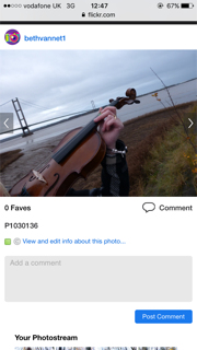
 I want my picture to be similar to these already taken image, I like how you can see the person's face but I would choose to make the angle see more of the woods.

Music Magazines Target Audience Research


Monday, 14 November 2016
Target Audience Research-Questions
Media-Questions
1.
How do you consume print media?
2.
If you don’t buy or download magazines, why not?
3.
What would encourage you to buy/download a
magazine?
4.
What genre comes to mind when seeing my
masthead?
5.
Is my front cover intriguing?
6.
What is the first thing you see when looking at
my front cover?
7.
Is there enough features to make it worthy for
the target audience to buy?
8.
Would you pay £3.99 for this magazine?
9.
Is there any clear visual links between the
front cover and contents page?
10.
Is my magazine suitable and intriguing for my
target audience?
11.
Is my font easy and clear to read?
12.
Do you think the black and white with highlights
of colours throughout the pages work?
13.
What sort of features am I missing?
14.
If you were to put my magazine back down in the
shop, what would be the reason?
15.
What do you like most about my front cover and
contents?
Target Audience Research- Slidely
Beth Vannet's Slidely by Slidely Slideshow
Demographic Profiling I want my magazine to focus on attracting older teenagers aged between 16-20 in the local area. My audience is very niche and will probably be popular for teenagers that have an interest and study music at school or college as they will be familiar with the classical genre. However, I'm going to try and grow my audience into more of the general teenagers who these days much prefer the pop and acoustic kind of style magazines. My magazine will defiantly be much more suited for the younger audience than to the stereotypical high class older audience who are suited normally with the classical music magazines. I will add elements to attract and fit the younger audience and I will keep the price low so middle class young adults will be able to afford it and make them believe the magazine is aimed at them. My audience will be more of the population which are willing to improve themselves so they might be interested in finding a new genre of music to listen too. My magazine will be colorful but still classy and have small activities to fit the fun/antics type of group. This all links to 'Barthes theory' of "The audience looks for signs to help them interpret the narrative...these deeply rooted signs are based on expectations the audience has due to their prior knowledge of old tales and myths". This links to that the younger audience will expect the stereotypical castles and high class women on the front of the magazine. Normally, well dressed and formal artists are photographed in front of a posh well kept area with instruments and natural classy colors. Whereas, they will see a middle class women with much more colorful features which they would normally see on a pop magazine. This will intrigue them into the magazine and hopefully be willing to buy it. Psychographic profiling I need my magazine to be a directed through the audience needs and desires, they want to see tour information and gossip about new and common artists of this day. This means I will advertise a new tour of the artist I'm making and have competitions which they can take part in. The four C's The Aspirers and Succeeders will defiantly be most interested in my magazine. As classical is not a genre which is popular for a young audience, its the people which are willing to buy a different magazine then there usual and trust that this style is a new style of classical which will suit them and their taste of music. I will add features which they commonly see on pop and acoustic magazines and add them to my magazine which will intrigue the younger audience. In The LifeMatrix segments my magazine will be suitable for the 'Tribe Wired' kind of people as my magazine includes lots of social media links throughout and links to websites where you can purchase tour tickets. I will also add competitions to win tickets which will attract the 'Fun/Atics' and 'Free Birds'. As I haven't decided a final price my magazine might attract the 'Struggling Singles' which don't have a lot of money so my magazine might be priced quite low to be suitable for this type of person to buy.
Friday, 4 November 2016
Star Image
A classical magazine is aimed at the high class older generation so the magazine has to represent the genre to make it appealing for them. I've found that the star image on the page has minimal make up and styled hair, this gives a classy and natural look to fit the genre. Unlike, a pop magazine which use a dramatic and colorful look to intrigue a much younger audience.
 The magazine shown below, the star gives a glowy and natural look. The makeup is nude and the eyes are not bold but still stand out. The lips are highlighted but not in any bright colors which could you distract you from the text. Also a bright lipstick like red symbolizes love which could be used in a vogue magazine to symbolize the vintage style and which was common in that time. The shot is a mid-close shot so you can see the whole of the star's face. You can tell the shot is from a studio and the hair has been styled to give the look that shes dressed up formally to suit the genre. I like the natural and glowy look, it makes the magazine look intriguing and pleasant to read. However, I do need to use some more bright colours to attract the younger audience I want my magazine to appeal too.

This magazine has much more closer shot of the stars face, which gives a much more closer look on to the star's make up. This star uses more bright and bold colours then the other classical magazine. The pink lips and the gold shimmery eye shadow are used to make the women look more formal and dressed up. The gold represents the classy look and the pink links to the highlight of red in the background. I like the touch of colour in this magazine but I would want it too much more bolder and neat.

However, this image was taken from a pop magazine of Adele. The look is styled this way in a studio shot to give a high classy look even though the magazine is normally published for the middle class. The black and white makes the eye liner stand out and give a bold effect but also give the minimal and natural look. I like the use of black and white which would follow my genre but I would consider using highlights of colour which would have synergy between all my pages.
 The magazine shown below, the star gives a glowy and natural look. The makeup is nude and the eyes are not bold but still stand out. The lips are highlighted but not in any bright colors which could you distract you from the text. Also a bright lipstick like red symbolizes love which could be used in a vogue magazine to symbolize the vintage style and which was common in that time. The shot is a mid-close shot so you can see the whole of the star's face. You can tell the shot is from a studio and the hair has been styled to give the look that shes dressed up formally to suit the genre. I like the natural and glowy look, it makes the magazine look intriguing and pleasant to read. However, I do need to use some more bright colours to attract the younger audience I want my magazine to appeal too.
This magazine has much more closer shot of the stars face, which gives a much more closer look on to the star's make up. This star uses more bright and bold colours then the other classical magazine. The pink lips and the gold shimmery eye shadow are used to make the women look more formal and dressed up. The gold represents the classy look and the pink links to the highlight of red in the background. I like the touch of colour in this magazine but I would want it too much more bolder and neat.

However, this image was taken from a pop magazine of Adele. The look is styled this way in a studio shot to give a high classy look even though the magazine is normally published for the middle class. The black and white makes the eye liner stand out and give a bold effect but also give the minimal and natural look. I like the use of black and white which would follow my genre but I would consider using highlights of colour which would have synergy between all my pages.
Tuesday, 1 November 2016
Locations Used In Existing Magazines
Through research I've found that most magazines use a plain background to fit the image of the artist instead of using a background. As the image of the artist is always a studio shot to get the particular image they want to get across to the audience, the artist is always styled a certain way. Then the background is edited to highlight a key theme or emotion.
 For example, this Q magazine the image of the artist takes up the whole page making the background a red/orange colour which is the artists hair. Orange is bright and symbolizes happiness and passion which is what the magazines wants to portray.

Also in a rock magazine a red background is used but this is used to highlight the features on the page. The same red is used to make keywords to stand out but then all the other features are in black and yellow which stands out from the red. Red is a common colour used in rock magazines and the convention is too use one colour background as there magazine is already quite crammed full of features so a one colour background makes it more easier to read.


Normally, the contents also only uses one colour for the background as there is a lot of text on this page so the page needs to be easy to read. Also the page includes a lot of images so the colours cant clash. So the publisher uses synergy between the pages to make a neutral background. However some contents take images of instruments or certain locations to use on that page to link to the articles. The Q magazine has the artist in a rural area and the smaller image it looks like a posh building which will suit the article the image is linked too.
I think I will use a different location for all my images I use, even though a plain background makes it easy to read I believe an interesting background would be more intriguing. Most classical magazines do use a location for the background but you expect to see high class buildings and music styled backgrounds like these shown. I would choose a much more exciting urban and colorful area to take my photos.


Photoshoot Plan
For my photoshoot I'm using my mum as the star, she's familar with the genre and is willing to do it. I'm going to break most of the conventions of the classical music magazine and make the audience believe that the genre isnt only for what is expected. Instead of the high class image the star will be dressed more middle class. She will be wearing, black jeans and a light coloured vest top with some plain trainers. I'm not using any bright coloured clothes as I dont want the background to clash with the image. Most classical music magazines use bland and neutral colours as the magazines are more unique and higher quality, I will use neutral colours around the artist and edit the background to make it more bright and intriging. I will always try and use a middle/long shot so you can see the whole appearance of the star. The backgrounds I think of using is the humber bridge,woods and down a small alley. These places are much more urban then the traditional castles and old buildings you see when looking through a traditional classical magazine. Also all these places are very easy to get too so I can access them at different times of the day to get the best photo I want.
I'm going to follow the convention of the artist holding a instrument in the image. The star will be holding a violin, this will be an effective part of the magazine as the artist alone might not give a clear idea of what the genre is as its so different to what you expect. I will also follow the code of quite neutral make up but I'm going to use a highlight of bright colours around the face eg. eyeshadow and lipstick. The colours I use for this will have synergy around all my other pages. The bright colours I use will make it more appealing for the younger audience I want to target and her hair will be natural and not be styled to follow the middle class and urban appearance.
I'm planning to take a picture of the Humber Brige in the dark with the star holding the violin in a silhoutte form to go across my double-page spread. As the background the will be black and greys I will be able too use gold writing which is a code for classical music magazines. All the other images i take in the different areas, I will experiment with different shots and angles to make the most effective image for my magazine.
Subscribe to:
Posts (Atom)