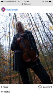
This picture also shows her powerful stance but this shows her whole body. I like how you can see how her whole outfit as one of the areas I want to reflect is that this artist is a classical artist but is still middle class. I would again have to enhance the colours to be most effective on the front cover.
This picture makes the background look interesting, the way the shot is took from a mid shot you can see a lot of the forest. However, you can still the artists face and violin. Even though she does look happier in this picture which I think is a key feature when intriguing a reader into a new artist, she's not looking into the camera. I think this picture would fit better on a contents page or dps as I think its important to have the artist much closer up and dominant on the front cover.
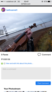
This image, I want to use on my contents page. Traditionally on a classical music magazine they use images of musical instruments and landscapes as well as artist pictures. I like this picture as you can see both. I would enhance the violin colours so it was much brighter than the urban background.
 I think this image shows too much of a soft artist when first looking at the magazine. Even though the colours have synergy between the leaves and violin, the star isn't looking at the camera. I could use this image on my contents and use a statement suggesting she's looking pass the media and focusing on her music.


No comments:
Post a Comment