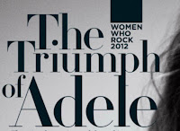
However,it challenges conventions as there is no eye contact towards the camera which usually intrigues the audience but in this article the most direct part is the text.The article is in black and white to have a classy feel and the artist face is quite promiscous which could attract the male audience which links to Mulvey's theory that states women are viewed for the pleasure of men.
The DPS uses a drop capital at the start of the text.It is considerably larger but the same font is used throughtout. The 'I' is a personal pronoun and is emphasised to make the article more personal. The article is Adele talking about herself which will attract the audience to find out more about this popular artist. Also the drop capital is the start of a quote which indicates its what Adele has said and make the article look exclusive, the quote is normally quite shocking to intrigue the reader to carry on which is a type of The Expose form.
 As adele is talking about her self the langage and register is quite casual.The language is informal as slang, swearing and colloqualism is used which goes againest the formal and smart look the article overall portrays. Also as swearing is used in the text the shows the audience will be much older.
 Even though the text is the same, the DPS does not use columns which is commonly used to seperate teh story and make it more appealing to read. However, this makes challenges the conventions as the text is written in one singular column. This could symbolise the one big conversation Adele is having. As this is for a older audience,the magazine is made to look mature and unique. So a thin line is used to separate the main article with the lead and a small black box is used at the top of the page. The lead uses a buzzword to intrigue the audience 'biggest' to make the audience believe its unique and worth reading.
  The is much bigger font compared to the rest of the text and is in serif font. It gives a antique and vintage look. The word 'triumph' is used and means victory so it suggets the artist is successful and has achieved something and worth reading for. The artists name is also used in the title to immediately indicate who the artist is. Using the artists name in the title is a code for the Rolling Stone double page spreads.
How research has informed my creativity and planning:
- The text font and size is effective and clear
- The drop capital is effective
- I like the natural look
- More unique symbols and pugs

A good piece of research here and your use of media terminology is much more proficient. This is much more like a Level 3 post - well done.
ReplyDelete