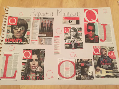
 I adhered to lots of codes and conventions of classical magazines and other magazines that are targeted at the same age group as who I wanted to read my magazine. I wanted both genre and audience to be easily recognizable so it would intrigue the right people into reading my magazine. First of all I used a bold masthead which you would find on most magazines, I located it in the 1/4th of the left corner and would be something my audience would recognize. Its the biggest font size used on this page and all other subtitles are in smaller font.
I followed the convention of having all my font lined up in columns along the side of page, this makes the magazine have a formal, organised look which you typically would find within a classical magazine. However, my title of the artist isn't lined up this is because I want it to stand out and intrigue the reader into this new
 artist.
  All the other text is sectioned with small lines in-between each article and are the same colour of the banners to create synergy. All other colours are light browns and gold's to represent autumn but also a premium look with the gold, the title and the puff of 'exclusive interview' has the same gold underneath to represent the importance and special addition to this certain magazine. You would commonly see gold on a classical magazine.
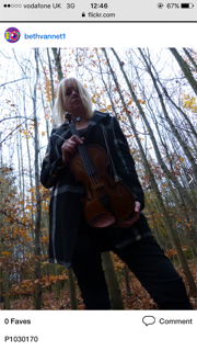
All the font stands out from the image which is a mid shot of the artist, you can see her face and is making eye contact to the camera. She is also holding a violin which is symbol of both classical music and classical magazines. All magazines have the date line and price and is a expectation for the reader.
I did challenge some codes and conventions on my front cover by not showing a typical higher class women with castle backgrounds. My star is a middle class women in a forest so its something totally different to what is found on a normal classical magazine. Also I used a deep blue colour for the name of the artist, this is a colour you wouldn't normally see on a classical magazine and more of a pop magazine. I used this as it would much more appealing to the younger audience I'm trying to attract.
Upon reflection, I believe my front cover was effective. I used many codes and conventions from other music magazines to attract the similar audience. Using a bold masthead, a picture with eye contact and many cover story's to intrigue the audience into buying the magazine, All these things worked well as there bold and show an 'exclusive' and packed magazine. As the front cover will be the first thing the audience sees it needs to look worthy to buy. However, the colour's wasn't as successful as I would have liked them to be. The colours need to be more bright and mixed using pinks,reds and blues to attract a mix of genders at a younger age,
Contents
 I followed most codes of contents pages this is because the page needs to be easily found and used to direct the reader to the wanted page. I used columns for the title and page numbers so they can be read easily and make the page organised. The articles that are highlighted on the front cover are in much bigger font than the others as this would be the articles that attracted the reader into buying the magazine.
 A lot of magazines use titles to make it even easier to find the article using 'features and 'regulars' and is a way to separate the articles. I also used the convention of using multiple images on the page, it separates the text and also links to the article with the page number in the corner. You commonly see images of scenery and instruments and this is what I used. In total I used 5 different images on this page.
Another thing I added was a subscription box, a lot of magazines offer these to persuade there customers into always buying there magazines.
 The only thing I did challenge was using social media links to attract with my audience. Commonly as a classical magazine is aimed for a older audience, social media links for sites like Instagram and Twitter are not used by the older population. However, as my target is much younger its a popular way to attract them in for using digital media.
 I think this page is comparable to other classical contents pages, Using a crammed but organised layout to show where is article is located and clearly labelled images, I think all the images are effective as I followed the conventions of what images work on other contents pages. Although, I think this page is very similar to others I would want to make each text clearer and use a range of fonts. Even though its readable I think it can be clearer and more colorful and to make it even more intriguing into all the other articles not just the main ones.
DPS
 I used the layout of having one image on the right page and the article on the other. The text is all lined up with each other and is in very small font. As my article is a interview, each question is separated with a box underneath so it stands out.
 The text is the same and the title is much bigger and is also underlined which you typically see to show the importance and make it look bold.
  I also used a drop capital of 'I' which is used to show its direct and personal about the artist. My page also uses the same colours throughout. The blue which I used on my front cover and the purple which I picked up from the image. The banner is in this colour and banners is something you normally see on a DPS.
However, I think I developed lots of codes and conventions on my DPS. First as my whole right page is the image, even though its midshot of my artist. The image is black and white, normally the image is bright and bold to intrigue the reader but instead I wanted to highlight the violin. This is because its a symbol of classical and the artist without it would make the genre not recognizable. Also the artist is not looking at the camera. A lot of images the artist wants to be looking at the camera to make the artist look dominant and powerful. I believe my artist is showing that she's looking out into her future being a upcoming artist,like she's looking away from all the media and focusing on portraying her music style.
Her article which is a interview uses slang and colloquial language, normally classical magazines use formal language only as its for much older and higher class audience.However, the younger audience much prefer more conversational language and 'gossip' but also they will be able to understand the slang used. Another thing I used which you wouldn't find on a typical classical magazine is shapes and symbols but also puffs. The shapes like the star link to the text would attract a younger audience but also the repeated music notes create synergy.
Another thing you wouldn't normally find is a pull quote, I used this quote as it uses slang and is something the reader could read first and be intrigued to read the full article.

My dps page is my favorite out of all my pages, I liked the layout of this page and the synergy of colours, This colours worked well and makes the black and white image stand out. However, I would want to add more highlights of colours like red and blue if I did it again. I like the text font and size as its clear and easily read and understood. Just overall, the colors may needed to vary more and attract a mix of genders as purple and browns attract more of a girly audience.


